ホバー時に左からアンダーラインをアニメーションで表示する
カーソルが当たった時(ホバー時)にアンダーラインが左から伸びるような CSS を作成します。
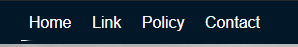
アンダーラインが左から伸びる
ここで作成するアニメーションは、次のようにアンダーラインが左から伸びる仕組みを作成します。
HTML は、 div や span などでもできるのですが、ここでは次のように a タグを使用しています。
<a href="#" class="c-slide-line--bottom">Home</a>ホバー時にアンダーラインを描画するため、疑似要素を使って表示とアニメーションを実装します。
a {
  text-decoration: none;
}
.c-slide-line--bottom {
  display: inline-block;
  position: relative;
  cursor: pointer;
}
.c-slide-line--bottom::before {
  position: absolute;
  content: '';
  left: 0;
  right: 0;
  bottom: -3px;
  width: 100%;
  height: 1px;
  background-color: #011729;
  transform: scale(0, 1);
  transform-origin: left;
  transition: transform .3s;
}
.c-slide-line--bottom:hover::before {
  transform: scale(1);
}
疑似要素の位置を固定するため、親要素に position: relative; を設定し疑似要素には position: absolute; を指定します。
transform , transition で、左から 1px の線を引きます。
transform: scale(0,1) の部分は、X方向とY方向の縮尺比率を指定します。初期状態では、X方向が 0 のため見えない状態になります。transform-origin は、要素を変形する際の原点を指定します。上記例では、 left と指定していますので原点は左端になります。
transition プロパティは、ある状態からそれとは違う別の状態へという二点間の変化を表現できるので、上記の場合 transform プロパティがホバー前と後の二点間で変化したときに .3s かけて変形していきます。
中央から左右に伸ばしたい場合
アンダーラインを中央から左右に伸ばしたい場合は、 transform-origin を center に設定します。
a {
  text-decoration: none;
}
.c-slide-line--bottom {
  display: inline-block;
  position: relative;
  cursor: pointer;
}
.c-slide-line--bottom::before {
  position: absolute;
  content: '';
  left: 0;
  right: 0;
  bottom: -3px;
  width: 100%;
  height: 1px;
  background-color: #011729;
  transform: scale(0, 1);
  transform-origin: center;
  transition: transform .3s;
}
.c-slide-line--bottom:hover::before {
  transform: scale(1);
}